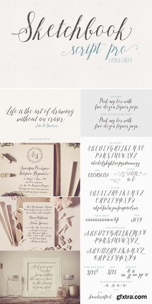

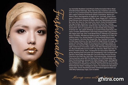
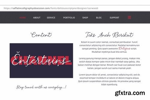
Noelia Script Pro
http://www.myfonts.com/fonts/vastago-studio/noelia-script-pro/
Noelia Script is a typeface inspired on the work of Doyald Young, Tommy Thompson, Matthew Carter and Giambattista Bodoni. This project is great to use in designs about sports, travel, and city postals, among others. This font has about 360 glyphs with stylistic alternates, old style numbers, serif caps, and a nice touch of classic penmanship. This is the result of a few months of work and that is it! Enjoy it! Thanks for buy it!
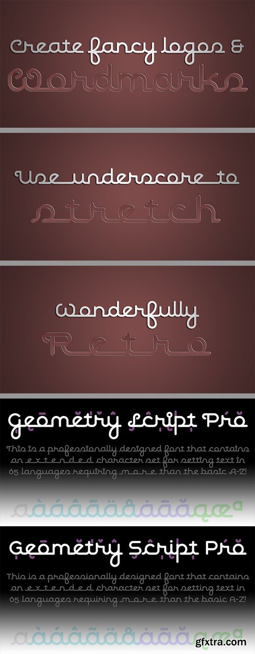
Geometry Script Pro - Rounded Script 50's Style of Connected Logomarks
2 Fonts | Designer: Roger S. Nelsson | Turkish Support
http://www.myfonts.com/fonts/cheapprofonts/geometry-script-pro/
![]()
![]()
![]()
![]()
![]()
![]()
![]()
The Geometry Pro family has been designed to be the final word in purely geometric fonts, and this rounded Script sub-family is a nod to the 50s style of connected logomarks. Words set with both the Regular and the Alternate (with its more flourished capitals and alternate stem connections) can be extended by using the underscore character between letters. You can freely mix and match glyphs from both fonts to create a little bit of variety, and finding that perfect combination.
For a matching set of capitals (and disconnected lowercase letters): check out the Regular weights of the Geometry Soft Pro family. All the Geometry Pro fonts are strictly geometric (as drawn with a compass and a ruler fixed to 90 and 45 degree angles) but they are not slavishly modular.
ALL fonts from CheapProFonts have very extensive language support:
They contain some unusual diacritic letters (some of which are contained in the Latin Extended-B Unicode block) supporting: Cornish, Filipino (Tagalog), Guarani, Luxembourgian, Malagasy, Romanian, Ulithian and Welsh. They also contain all glyphs in the Latin Extended-A Unicode block (which among others cover the Central European and Baltic areas) supporting: Afrikaans, Belarusian (Lacinka), Bosnian, Catalan, Chichewa, Croatian, Czech, Dutch, Esperanto, Greenlandic, Hungarian, Kashubian, Kurdish (Kurmanji), Latvian, Lithuanian, Maltese, Maori, Polish, Saami (Inari), Saami (North), Serbian (latin), Slovak(ian), Slovene, Sorbian (Lower), Sorbian (Upper), Turkish and Turkmen.
And they of course contain all the usual “western” glyphs supporting: Albanian, Basque, Breton, Chamorro, Danish, Estonian, Faroese, Finnish, French, Frisian, Galican, German, Icelandic, Indonesian, Irish (Gaelic), Italian, Northern Sotho, Norwegian, Occitan, Portuguese, Rhaeto-Romance, Sami (Lule), Sami (South), Scots (Gaelic), Spanish, Swedish, Tswana, Walloon and Yapese.


HT Script allows you to Insert Headers and Footers Code, insert Google Analytics, Facebook Pixel, custom CSS, custom HTML, javascript code to your website header and footer without modifying your theme code. This plugin has the option to add any custom code to your theme in header/footer, no need to edit the theme code. It will save your time and remove the hassle for the theme update.
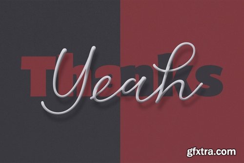

Carioca Script Pro Font Family | 2 x TTF and OTF
http://www.myfonts.com/fonts/stiggy-sands/carioca-script-pro/
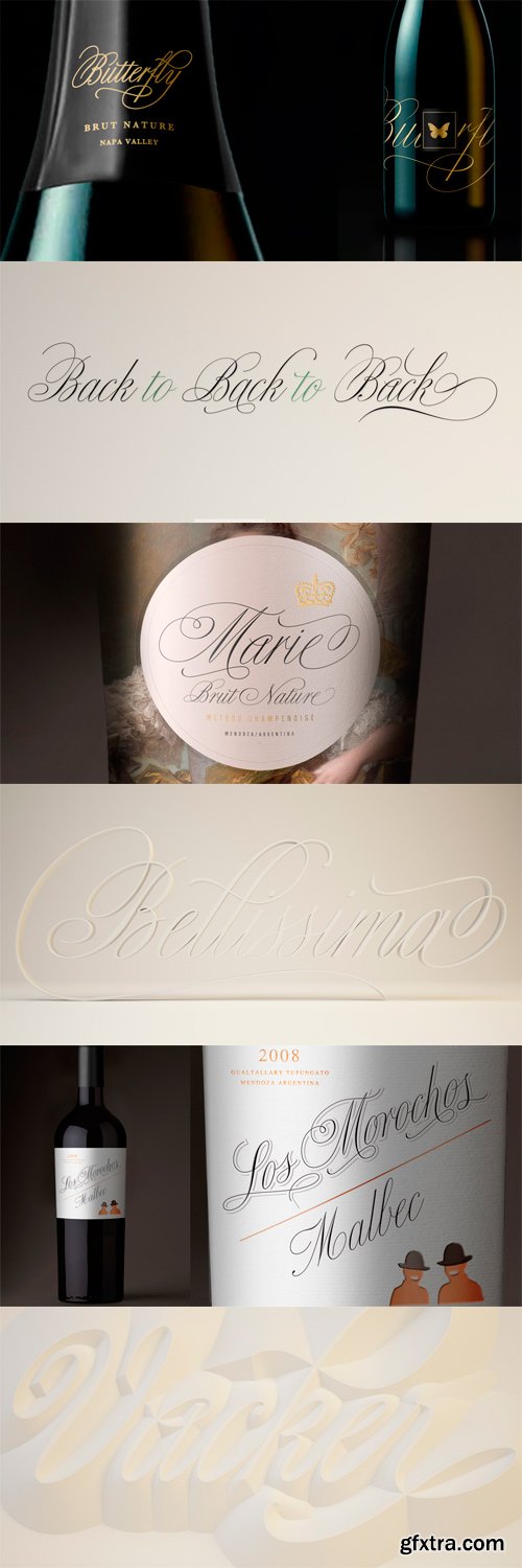
While in the same vein and spirit as Burgues and Compendium, Bellissima began from an entirely different thread from those fonts. It started with Alex Trochut generously showing me a gorgeous lettering book from his grandfather’s library: Bellezas de la Caligrafía, by Ramón Stirling, 1844. Stirling was one of the Latin calligraphy pioneers who introduced a refined version of English calligraphy in Spain and made it popular in the nineteenth century. Some scans from that book served as initial basis for the caps in my Poem Script. But it was always
in the back of my mind that I should do a copperplate, and the Stirling model was the perfect source. My intention was to veer away from Stirling’s exuberant ornamentation, and work within simplified forms of his ideas. As it usually is with most of my projects, Bellissima became its own bird and shaped its own flying patterns. Suddenly there were many ligatures, multiple endings and swashed connections, hundreds of alternates for both uppercase and lowercase. Bellissima has an effusive energy that appeals much beyond its sourcing. It’s intended for these modern times of appreciation for old crafty things like stationery and letterpress, where its origins help it shine brightly. Bellissima Script Pro is a complete font with almost 2000 characters full of alternates, swashes, ligatures & ornaments covering a wide palette of latin languages.
OTF + TTF | 2 Fonts | JPEG Preview | 12.4 Mb RAR
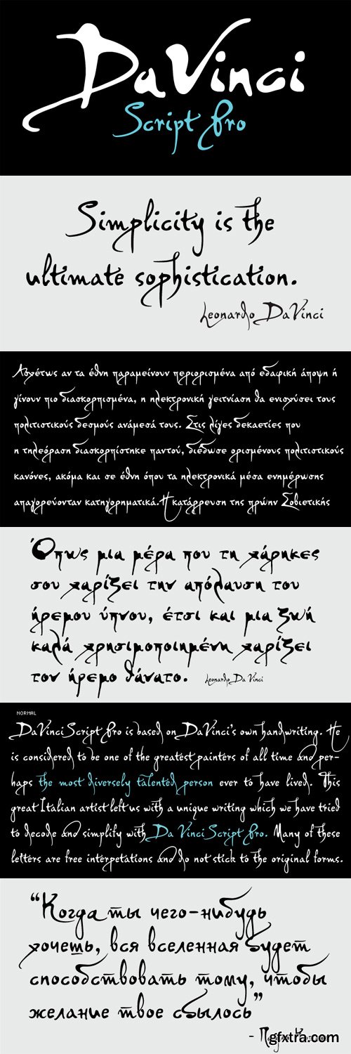
PF DaVinci Script Pro Font Family
PF DaVinci Script Pro is based on DaVinci’s own handwriting. He is considered to be one of the greatest painters of all time and perhaps the most diversely talented person ever to have lived. This great Italian artist left us with a unique writing (used to write from right to left), which we attempted to decode and simplify with PF Da Vinci Script Pro. Many of these letters are free interpretations and do not stick to the original forms. This typeface comes in 2 different styles: Regular and a more informal style called Inked. The all new “Pro” version supports all European languages including Latin, Greek, Greek Polytonic and Cyrillic. It comes loaded with many stylistic alternates in all languages.
TTF | 2 Fonts | JPEG Preview | 4.6 Mb RAR
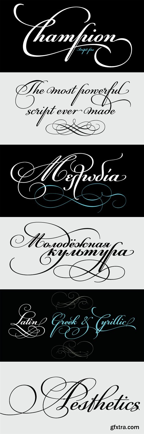
PF Champion Script Pro Font Family
PF Champion Script Pro is perhaps the most advanced and powerful calligraphic family ever made. It received an award for Excellence in Type Design from the International Type Design Competition ‘Modern Cyrillic 2009’ which was held in Moscow. Most recently, it received another award from the 3rd International Eastern Type Design Competition - Granshan Awards 2010. This typeface was first presented in June 2007 at the 3rd International Conference on Typography and Visual Communication (ICTVC) and was met with rave reviews. It is based mainly on the manuscripts of the 18th century English calligrapher Joseph Champion. Developed over a period of two and a half years, each one of the 2 weights is loaded with 4300 glyphs(!), offering simultaneous support for all European languages based on the Latin, Greek and Cyrillic scripts. Furthermore, a wide selection of alternate forms and ligatures is included for all languages, in order to accommodate diverse design aesthetics. These alternates are either applied automatically through an advanced programming scheme, or manually through several OpenType features. An attempt was made to design a contemporary script typeface with classic roots, by following certain guidelines, i.e. lowercase characters were designed so they are less inclined, have a higher x-height and are less condensed than the original. Several characters were stripped-off their connecting lines in order to enhance legibility. Four sets of alternate swashed capitals as well as a plethora of ornaments and frames (117) was included. Small caps and their alternate forms were designed to replace the capitals which disrupt the flow of text within a sentence with their extravagant swashes. All characters were carefully designed with the proper weight in order to sustain harsh printing conditions (on special papers), a situation which affects mainly the light connecting parts of calligraphic typefaces. Finally, it was programmed in such a way as to preserve handwriting qualities, by designing an extensive array of ligatures and alternate glyphs in all languages, never before released or incorporated within the same font.
OTF | 2 Fonts | JPEG Preview | 5.3 Mb RAR
SermonBox - Seasonal Collection

SermonBox - The Series Pack Collection

Top Rated News


Would you like to be a Author?


